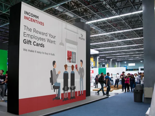
FinTech Company Increased Lead Generation by 105% with Trade Show Department Rebrand
Case Study: InComm Digital Solutions
Background
The Results
“Yanique is super creative, flexible, and versatile.
She’s excelled at updating our exhibition designs with a new creative approach while making sure to evolve within the brand guidelines. She went above and beyond by providing research to support her design choices as well as creating a design chart for it. She also supported our International events that were a huge success. I truly enjoyed working with her!”

– Nilce Gabriela Piccinini, InComm
Kailey Gallagher – Sr. Account Manager, InComm Digital Solutions
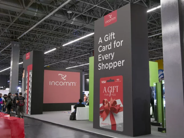
The Process
Color
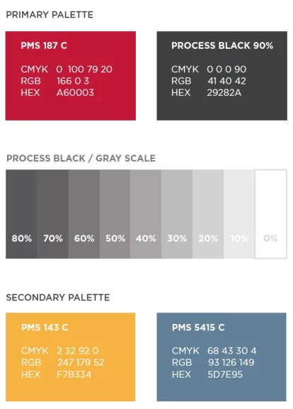
The trade show booth design isolates specific colors in the InComm color palette to create the best visual solution for the trade environment.
PMS 187 C should always be used in the logo tag.
Process Black 90% must be used as the predominant color for all artwork.
Tints of the Process Black 90% should be used to create additional visuals with the exception of skin tone representative colors.
The secondary palette can be used to highlight or accent artwork but should never be the most dominant color used on any one piece.
Logo Usage
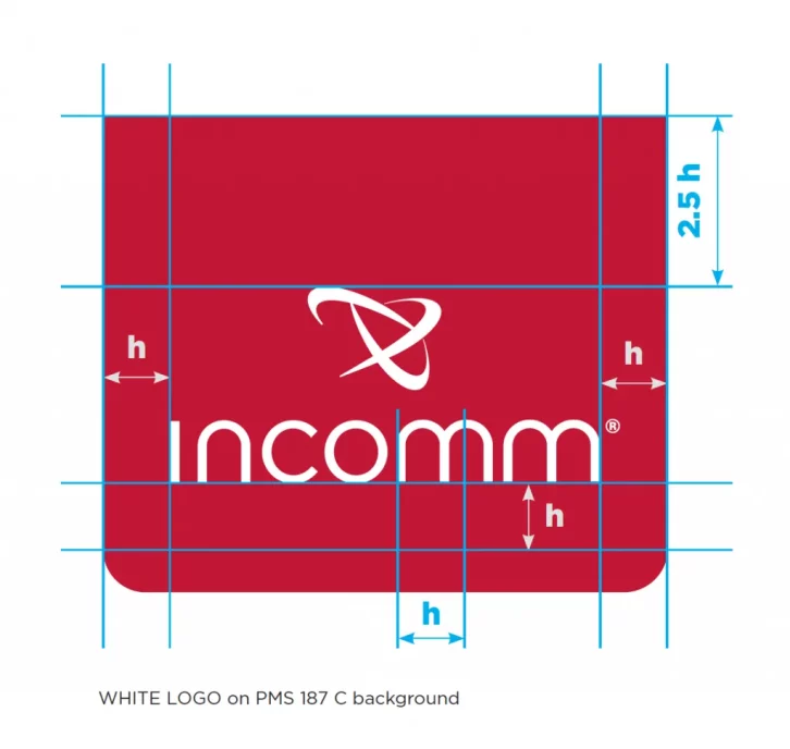
We decided to encase the white logo PMS 187 C to create a logo tag on the top of all booth graphics.
