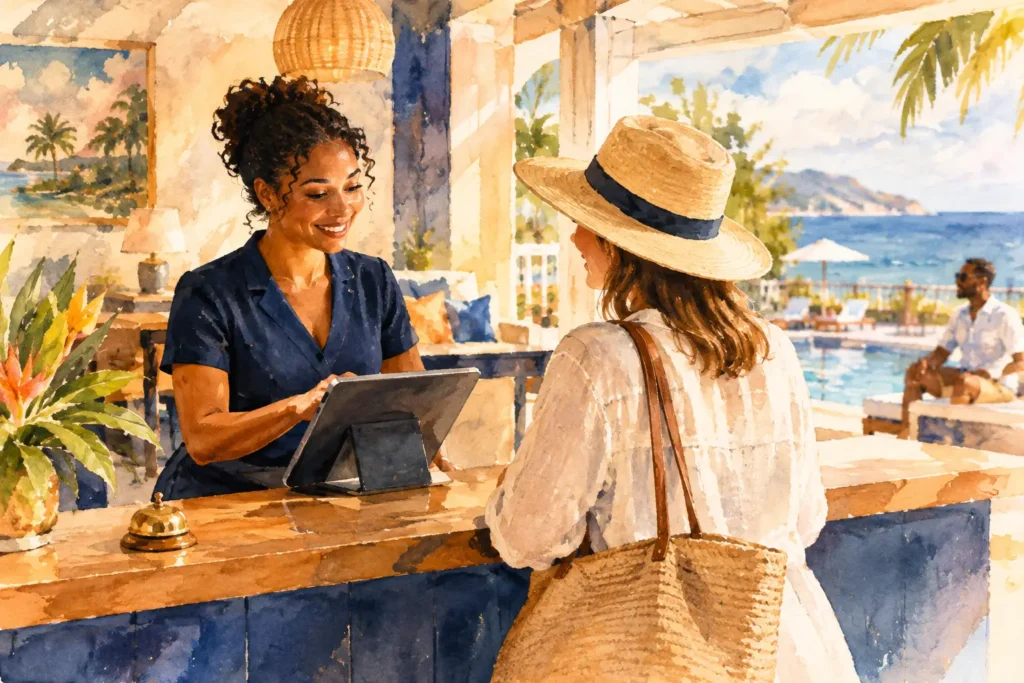

A hotel website redesign example is only useful if it shows more than a new color palette and sharper photography. For an independent property, the website is where guests decide whether the experience is worth the rate, whether the location fits the trip, and whether booking direct feels like the smartest move. A redesign should turn that decision into demand.
Consider a 42-room boutique hotel in a walkable downtown district. The property has strong bones: a restored historic building, a popular lobby bar, and an audience split between weekend leisure travelers and midweek business guests. Yet its old site treats every visitor the same. The homepage opens with a generic room image, the booking button is easy to miss, and the copy could describe almost any hotel in the market.
The property does not have a traffic problem. It has a conversion problem. That distinction changes the entire redesign strategy.
Hotel Website Redesign Example: From Pretty to Profitable
Before the redesign, this hotel’s digital experience creates friction at every meaningful decision point. Its navigation prioritizes internal hotel language over guest intent. Room pages list bed configurations but fail to make each stay feel distinct. Local recommendations sit on a neglected blog, disconnected from the booking path. The booking engine opens in a jarring interface that looks unrelated to the hotel guests just spent time considering.
The new site begins with a sharper position: this is not simply a downtown hotel. It is a design-forward basecamp for travelers who want to be in the middle of the city’s food, music, and culture without sacrificing a considered place to reset.
That decision has commercial consequences. It gives the hotel a reason to lead with experience, not amenities. It also gives prospective guests a reason to choose the property over a larger competitor with more rooms, a familiar flag, or a lower advertised rate.
The homepage now leads with a concise promise, followed by photography that communicates atmosphere and location. A booking module appears immediately, but it does not interrupt the story. It supports it. The guest sees dates, room options, and a clear direct-booking value proposition before scrolling far enough to lose intent.
This is not decoration. It is brand infrastructure working where revenue is won.
The homepage earns the next click
A high-performing hotel homepage does not need to tell the whole story. It needs to create enough confidence and desire for guests to keep moving. In this example, the page is organized around the questions a guest is already asking: Why stay here? What will my room feel like? What can I do nearby? Why book direct?
The hotel replaces vague phrases such as “unparalleled comfort” with specific proof. It calls out the lobby bar’s late-night vinyl sessions, the rooftop views, the neighborhood’s independent restaurants, and the property’s thoughtful in-room details. The language is edited, confident, and sensory without becoming precious.
A site redesign can overcorrect here. Too much storytelling before a guest can see rates or room types creates a beautiful brochure, not a booking tool. The right balance depends on the property’s audience, average length of stay, and rate strategy. A high-consideration luxury stay can support more narrative. A roadside boutique property serving frequent travelers may need a faster path to availability.
Room pages sell the stay, not the square footage
The original room pages use nearly identical descriptions for every category. Guests can compare room sizes, but they cannot understand why a corner king costs more than a standard queen. That makes rate differences feel arbitrary and pushes shoppers toward the lowest available option.
In the redesign, every room category is framed around the guest it serves. The Corner King becomes the choice for longer stays, with natural light, a reading nook, and space to work without turning the bed into a desk. The Terrace Suite becomes the room for celebrations, slow mornings, and private outdoor space. Essential facts remain easy to find, but they no longer carry the entire sales job.
This approach protects pricing power. When room categories are distinct in both function and feeling, guests have a clearer reason to trade up. Better content does not guarantee a higher average daily rate, but it gives the rate strategy a credible foundation.
What Makes This Hotel Website Redesign Convert
The strongest redesigns align three systems: brand positioning, guest experience, and performance marketing. If one is missing, the site loses force. A striking identity without a clear booking flow limits conversion. A well-configured booking engine without a differentiated story invites price comparison. Paid campaigns that drive traffic to a vague homepage spend money without building demand.
For this hotel, the redesign creates alignment in several practical ways.
First, direct booking benefits are specific and visible. Rather than a generic “Book Direct and Save” message, guests see advantages that fit the brand: flexible cancellation on select rates, priority access to rooftop events, and a welcome drink at the lobby bar. If the hotel cannot support meaningful perks or rate parity, it should not make inflated promises. Credibility matters more than a banner that every guest has learned to ignore.
Second, the site treats the neighborhood as part of the product. The local guide is rebuilt as a conversion asset, not a content archive. It organizes recommendations by real trip moments: a one-night date weekend, a concert night, a first-time visit, and a quick business trip with an extra evening. Each guide leads naturally back to relevant rooms and offers.
Third, the booking path stays consistent. The visual system, voice, and guest reassurance continue through key booking steps. Guests do not feel as if they have left the hotel’s world and entered a generic transaction window. Depending on the booking platform, full visual control may be limited. Even then, a property can improve continuity with clearer rate descriptions, better room imagery, reassurance around fees, and a more intentional handoff.
Mobile is the real front desk
For many boutique hotels, mobile visitors arrive from social posts, map listings, creator coverage, or a quick search while plans are still forming. They are often close to booking, but they have little patience for oversized video, tiny booking fields, or navigation that requires too much hunting.
In this example, mobile design is not a compressed desktop layout. The redesign places availability, room comparisons, location cues, and direct-booking benefits within easy reach. Images load with purpose. Calls to action are clear. Important details, including parking, pet policy, and check-in information, are available before uncertainty becomes abandonment.
A fast mobile site is not a technical luxury. It is a demand-capture tool. If a prospective guest has to wait, pinch, scroll, or guess, the OTA tab is already open.
The Metrics That Tell You Whether It Worked
A redesigned site should be measured against business outcomes, not applause. A spike in time on site may be encouraging, but it does not mean the property is making more money. The more meaningful question is whether the new brand system improves the quality and conversion of demand.
Track direct booking conversion rate alongside total direct revenue. Watch average daily rate and revenue per available room by channel, especially if the redesign is intended to support a more premium position. Review room-category mix to see whether guests are trading up. Monitor booking-engine abandonment, mobile conversion, and the share of traffic entering from paid campaigns, organic search, maps, and social.
Context matters. Seasonality, market compression, changes in distribution, and promotional activity can all affect results. A redesign is not a substitute for rate management or operational excellence. But when the site clearly communicates the property’s value and removes avoidable friction, it gives every other demand-generation effort a stronger place to land.
Start With the Revenue Question
The wrong first question is, “What should our new website look like?” The better question is, “What must a guest believe, understand, and do before they book direct at the rate we need?”
That question exposes the gaps quickly. Perhaps the hotel has no clear reason to choose it over nearby alternatives. Perhaps its photography shows rooms but not the experience around them. Perhaps the booking process hides the value of direct reservations. Perhaps the brand promise ends at the homepage instead of carrying into the stay.
A website redesign is the moment to solve those issues as one connected system. That is where the magic becomes measurable: a sharper story, a more confident guest decision, and a digital presence built to create demand long after launch day.
Before approving another homepage concept, walk the booking path on your phone as a first-time guest. If the reason to stay, the reason to book direct, and the reason to pay your rate are not immediately clear, the opportunity is not cosmetic. It is commercial.